Framework UI Redesign
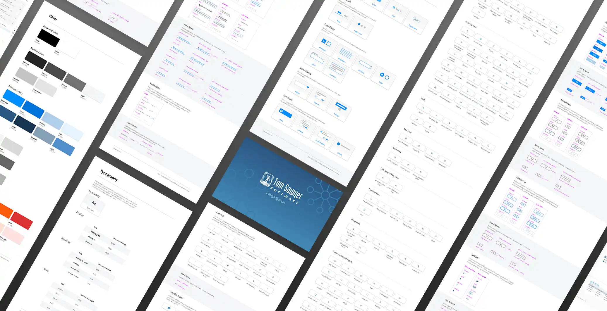
Design System
Client:
Tom Sawyer Software
Scope:
UI Library
Year:
2024-Present
OVERVIEW
I worked closely with product managers, developers, and other stakeholders to redesign the Classic Web Preview for Tom Sawyer Perspectives, building a design system to unify and modernize the framework's web applications. The original interface had no consistent design language — a cluttered layout, low-quality generic icons, unintuitive navigation, and an outdated look that put us behind more modern competitors, putting client trust at risk.
My role was driving the design side of the system: establishing reusable components, a coherent icon set, and consistent interaction patterns, using a Design Thinking approach and close cross-departmental collaboration to rebuild the web application experience around real user needs and technical constraints.
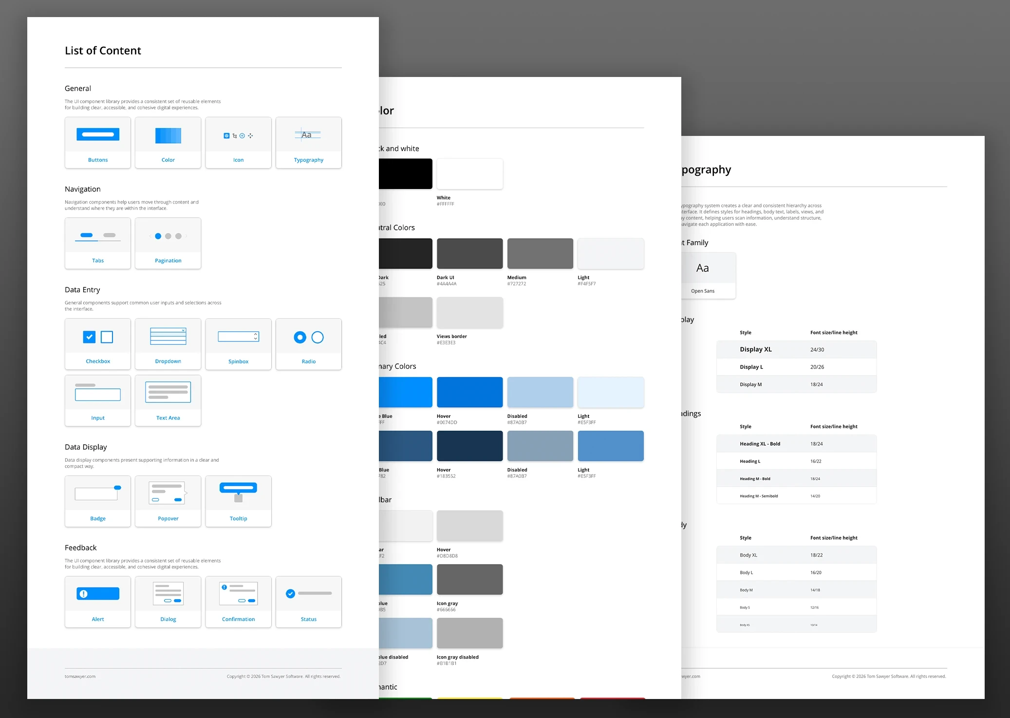
The result, the Modern Web Preview, replaced fragmented one-off screens with a scalable design system — improving usability and visual consistency across the framework, and directly strengthening client-facing touchpoints like demos, proofs of concept, and custom applications built on the platform.
THE CHALLENGE
Cognitive Overload. Identified a cluttered and overwhelming interface that hindered user focus and task completion.
Visual Inconsistency. Diagnosed a reliance on low-resolution, generic iconography that lacked contextual relevance and diminished product quality.
Navigational Friction. Addressed fragmented workflows across drawing, table, timeline, and tree views that complicated cross-module navigation.
Competitive Disadvantage. Rectified an outdated aesthetic that drove prospective clients toward competitors with more modernized, user-centric interfaces.
MY PROCESS
Empathize & Research
Led comprehensive UX research—including competitor benchmarking, cross-functional stakeholder interviews, and deep-dive audits of six complex interface views—to align technical constraints with user goals.
Define
Translated documented usability gaps—including visual clutter and navigation hurdles—into core requirements for a modern, scalable design system built for long-term intuition and growth.
Ideate & Prototype
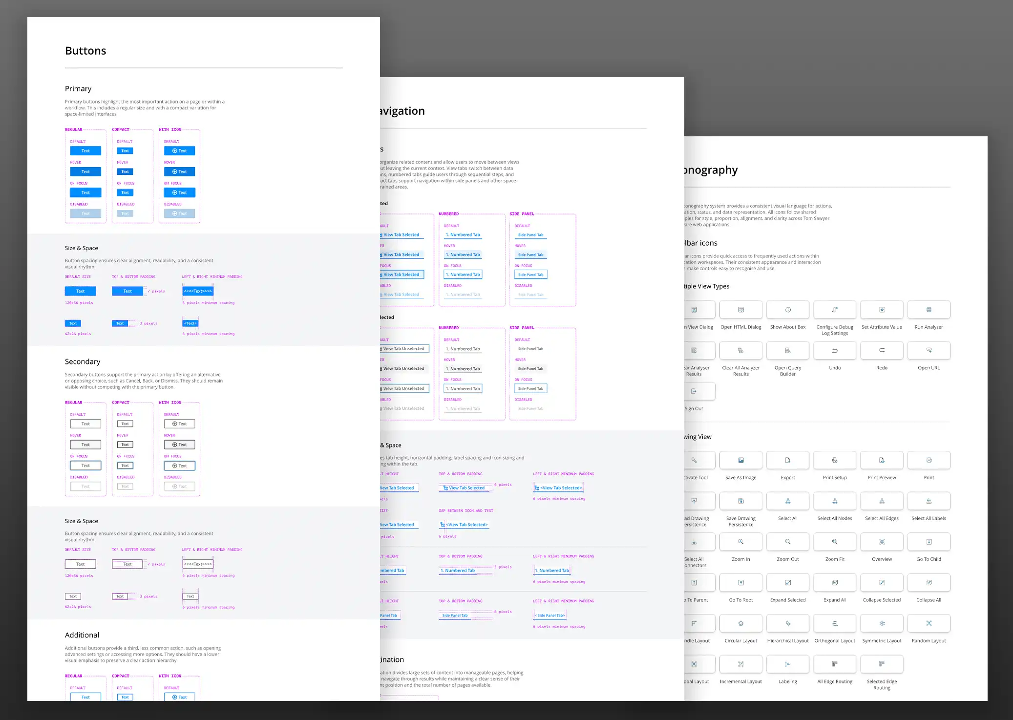
Engineered rapid, iterative prototypes for all primary views, streamlining layout and hierarchy while designing a custom library of 150+ icons to ensure precise visual communication across the platform.
Test & Refine
Validated design efficacy through advanced prototyping and cross-functional collaboration with Product, Layout, QA, and Documentation teams to ensure technical feasibility, resolve inconsistencies, and synchronize updated workflows.
Implementation
Partnered with Product Development to launch the "Modern Web Preview," a comprehensive design overhaul successfully deployed across all live demos, PoCs, and the core product roadmap.
OUTCOME
Optimized User Experience. Modernized the interface to significantly improve usability and eliminate cognitive overwhelm for complex data tasks.
Unified Visual Language. Developed a custom library of 150+ icons to clarify feature functionality and streamline navigational flow.
Scalable Design Standards. Established a clean, robust design system that enhanced visual consistency and bolstered client confidence in the platform.
Cross-Functional Satisfaction. Elevated product trust and satisfaction scores across key user groups, including engineers, analysts, and product managers.